Tips for the Designing of Unique and Attractive Blog Posts
Designers have began to inject increasing levels of creativity into their blog posts and articles, throwing out the traditional and generic style of blog posts in favour of a much more attractive layout that’s themed specifically to the content. Let’s take a look at some of the best examples, and see what makes them work so well.
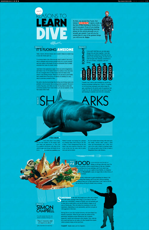
In his fantastic article ‘The Death of the Boring Blog Post‘, Paddy Donnelly sums up this method of fusing together a blog post with the style and design of a traditional magazine article and coins the name, ‘Blogazine’. Be sure to check it out for a great introduction, and to hear from some of the pioneers of this style of blogging.
Examples of the best
Scrap the traditional website layout
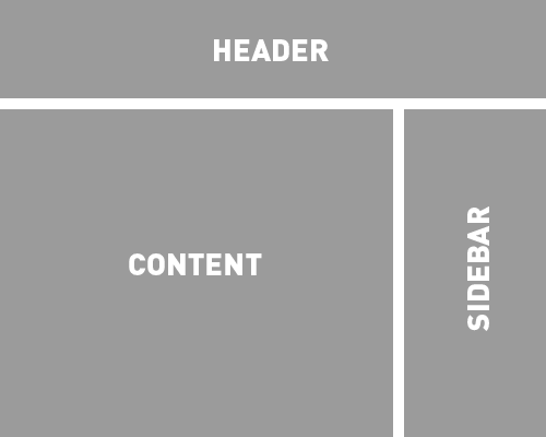
We’re all used to blog themes with the traditional two-column content and sidebar layout. But to really create a custom and unique post design, all the common practices are thrown out of the window in order to give yourself a blank canvas to start from. There’s no header, there’s no footer, there’s no sidebar. Instead, the whole page is open to housing the content any way you wish; you really have to break free of the usual web design mindset, and think out of the box in terms of creativity to portray your information in an interesting and enticing way, but also keeping everything readable and accessible. This does subsequently induce a lot of work, as your whole post needs to be completely designed and styled from scratch, using a unique CSS stylesheet and HTML code, but the main advantage is having a unique post that captures the user’s interest and easily puts across your message.
Scrap the traditional website layout
We’re all used to blog themes with the traditional two-column content and sidebar layout. But to really create a custom and unique post design, all the common practices are thrown out of the window in order to give yourself a blank canvas to start from. There’s no header, there’s no footer, there’s no sidebar. Instead, the whole page is open to housing the content any way you wish; you really have to break free of the usual web design mindset, and think out of the box in terms of creativity to portray your information in an interesting and enticing way, but also keeping everything readable and accessible. This does subsequently induce a lot of work, as your whole post needs to be completely designed and styled from scratch, using a unique CSS stylesheet and HTML code, but the main advantage is having a unique post that captures the user’s interest and easily puts across your message.
Take inspiration from print design
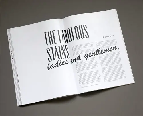
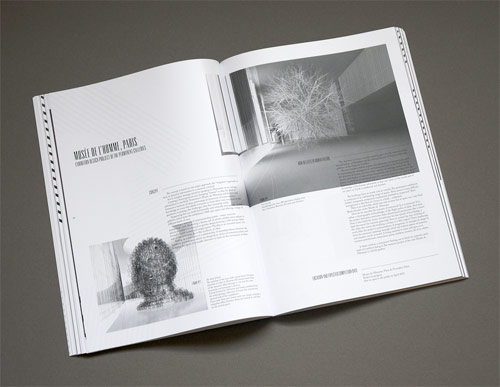
For decades, designers working in print have used the core design principles to create balanced layouts in magazines and posters. To create the best designed blog post, go back to basics and follow the basic rules of space, colour, shape and type. For inspiration, check out any magazine article for ideas on how to combine images and text, using different type sizes, weights and fonts to portray a certain feeling, or to highlight particular elements of the content.
A grid is your friend
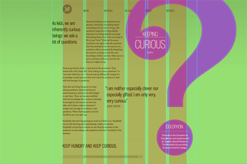
Because we’re now working with a completely blank canvas, it’s important to achieve balance in your new post design. Basing your design on an underlying grid will help develop an eye-pleasing design that’s easily consumed by the reader. On the contrary, simply placing elements where you see fit could end up with a page that’s difficult to follow and doesn’t flow from one element to the next.
Do not worry about scrolling
Unlike a magazine that can span across multiple pages, as web designers we’re stuck with continuously moving downwards. After balancing out your design with lots of large elements and plenty of white space, it’s highly likely that your post will take up maybe 5 times the space it would have done if it was written as plain old text in the traditional format. Unfortunately this is one sacrifice that has to be made. While an excessive amount of scrolling could impact the usability of your page, it’s safe to say that users are used to navigating with the scroll wheel, so don’t worry about stretching out your page length in favour of a unique design.